Project Report
The goal of this project is to colorize images taken by Prokudin-Gorskii a 100 years ago. This write up will go over my methadology & will show the final colored images processed.
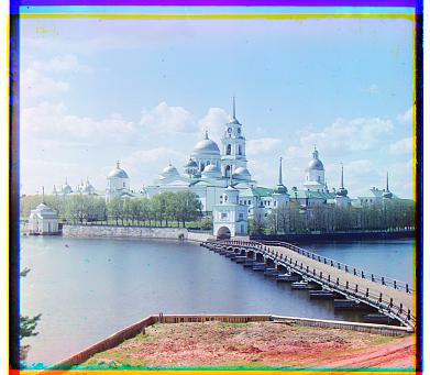
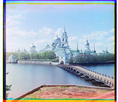
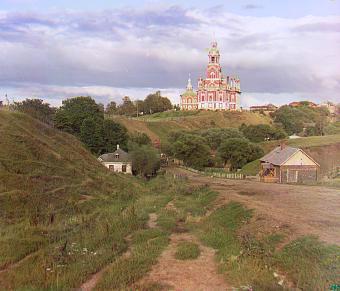
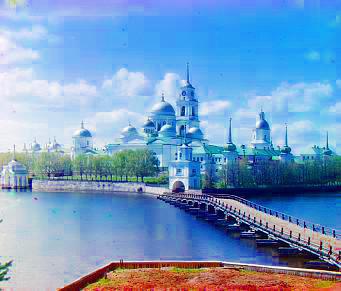
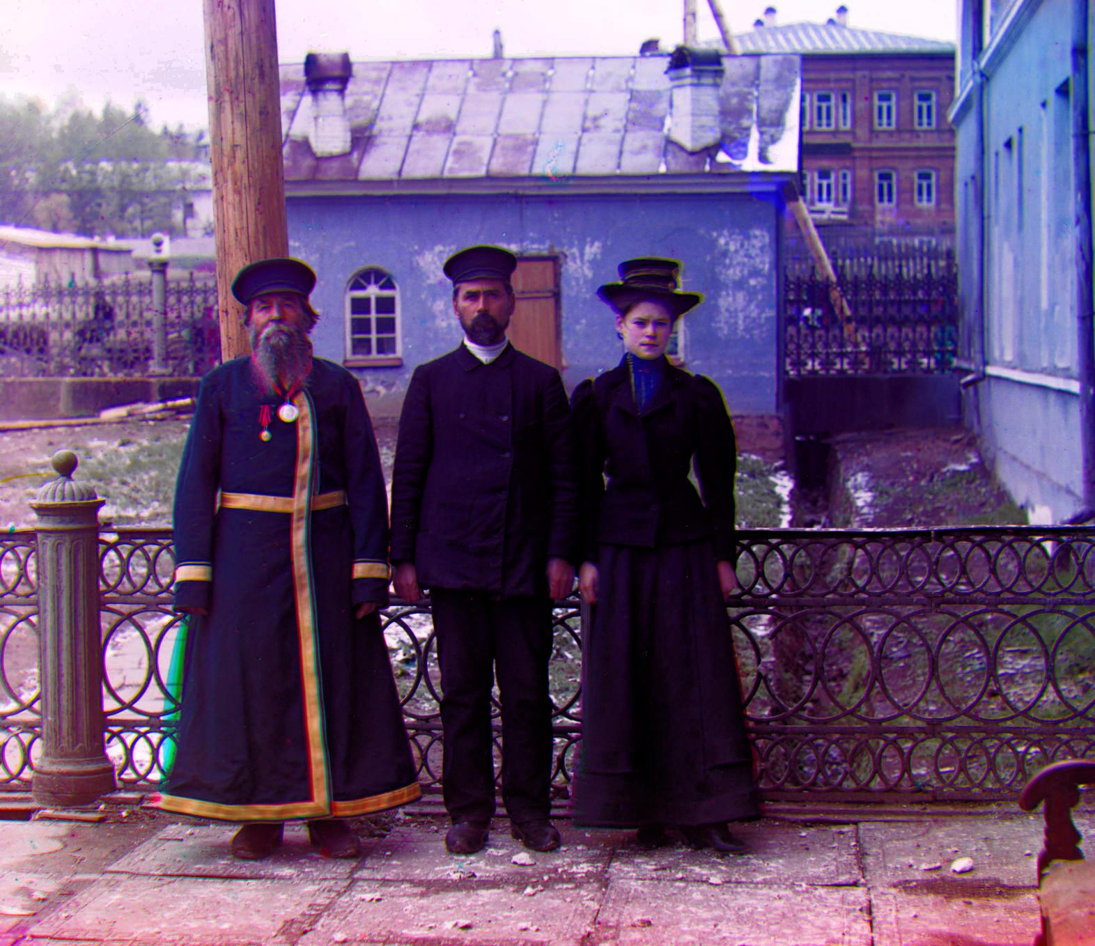
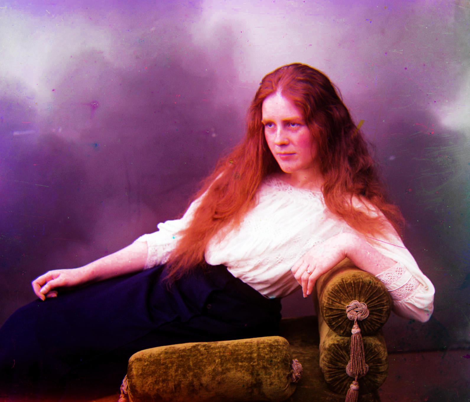
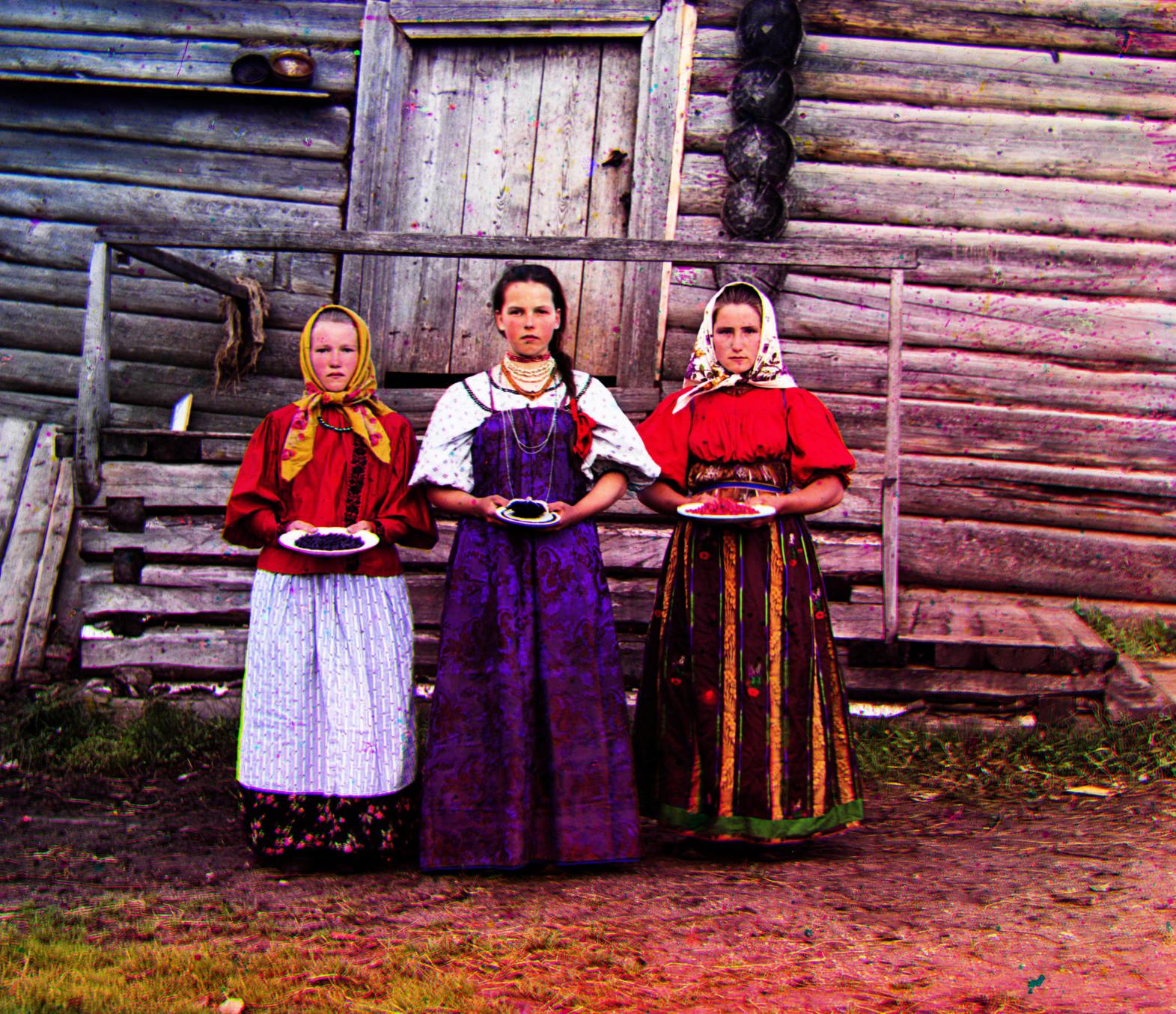
Results Sneak Peak
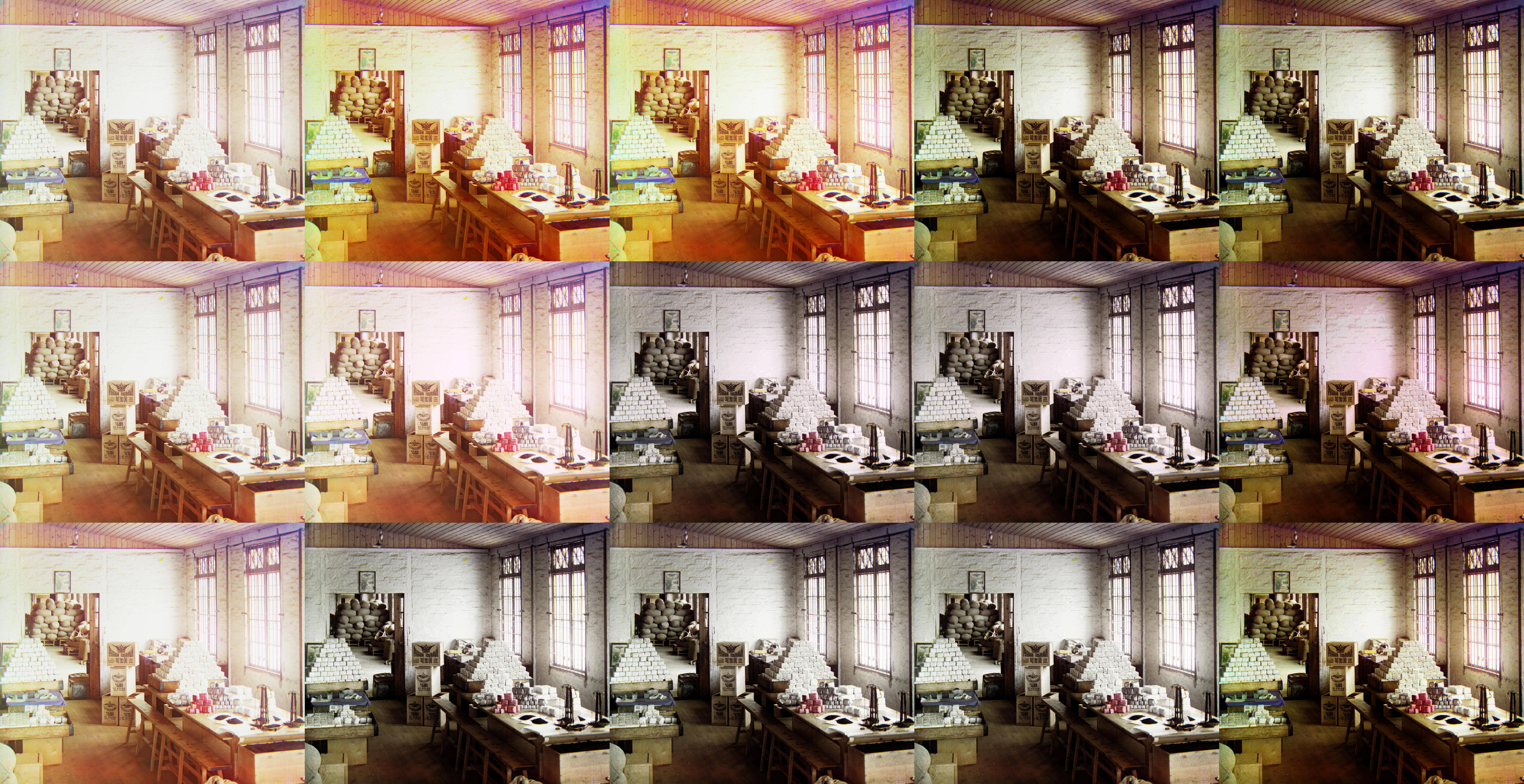
Table of Contents
- Dissimilarity Metric
- Image Pyramid Alignment & Parameters
- Alignment Region*
- Padded Rolling*
- Edge/Gradient Alignment*
- Base Channel Selection*
- Border Cropping*
- Auto White Balancing*
- Auto Contrast*
- Image Denoisification*
- Making Colors Pop*
- Operation Order*
- Photo Gallery
- Additional Images
- Offset Values
Introduction
Sergei Mikhailovich Prokudin-Gorskii (1863-1944) [Сергей Михайлович Прокудин-Горский, to his Russian friends] was a man well ahead of his time. Convinced, as early as 1907, that color photography was the wave of the future, he won Tzar's special permission to travel across the vast Russian Empire and take color photographs of everything he saw including the only color portrait of Leo Tolstoy. And he really photographed everything: people, buildings, landscapes, railroads, bridges... thousands of color pictures! His idea was simple: record three exposures of every scene onto a glass plate using a red, a green, and a blue filter.
He envisioned special projectors to be installed in "multimedia" classrooms all across Russia where the children would be able to learn about their vast country. Alas, his plans never materialized: he left Russia in 1918, right after the revolution, never to return again. Luckily, his RGB glass plate negatives, capturing the last years of the Russian Empire, survived and were purchased in 1948 by the Library of Congress. The Library of Congress has recently digitized the negatives and made them available online.
Now, I'm going to attempt to colorize these use these exposures to get colorized images of 20th century Russia.
Color Channel Alignment
For each image we're actually working with three different images, one for each different filter used to take the pictures.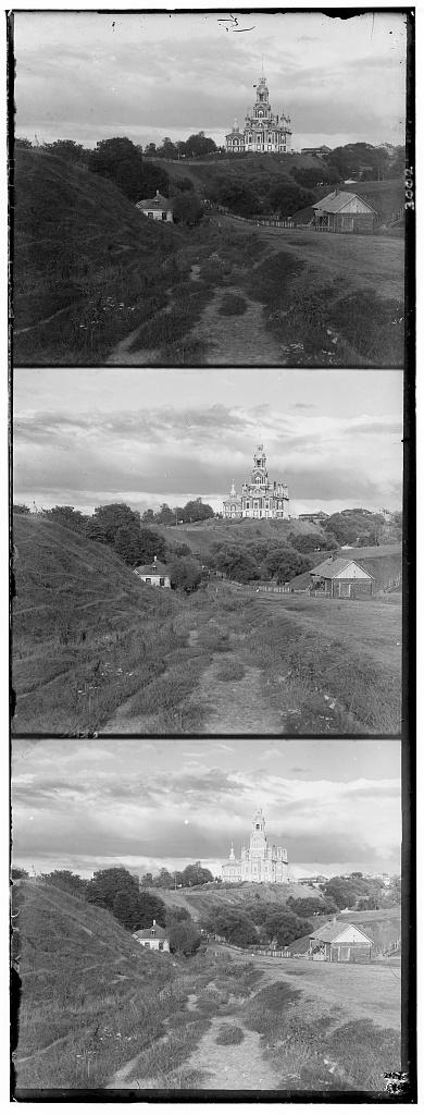
We need to first split up this image into three channels and then align them so we can get a desirable colored image. Sadly, we can't just naively overlap the channels because the channels are ever so slightly different from each other. These differences could have popped up because of moving subjects or slight changes in camera movement. We need a way to align these channels based using channel data.
1. Dissimilarity Metric
A dissmilarity metric helps us score how well two channels align. We can use it as a cost function to get channel alignments which minimize this metric. I tried two such metrics: Sum of Squared Differences distance (SSD) and the Normalized Cross-Correlation (NCC), which is simply a dot product between two normalized vectors.
Between the two, I found SSD was providing better results so I used that as my metric. Here are the images from above aligned using SSD* by trying offsets in [-20, 20] along both axis.
2. Image Pyramid Alignment & Parameters
While just simple alignment using SSD worked for low res images, naively doing that for larger images using a small fixed offset bound to search from would neither work very well nor would be efficient. I implemented Image Pyramid alignment which aligns high resolution images efficiently by downscaling them by a preset scaling factor multiple times. The algorithm uses the the best alignment offsets from the last level (lower level resolution) to calculate the offset bound to search in at the current resolution. Recursively doing this helps us find a good alignment by greatly restricting the alignment offset search space.
 Parameters:
- Scaling Factor: 0.75
- Number of levels: 9
scaling_factor num_levels using multiple values of these parameters and went with the ones above because they yielded an image that wasn't too downscaled & the [-20, 20] base offset search space intuitively made sense at that level.
3. Alignment Region
Simply just aligning channels doesn't yield the best results as the images have funky borders and in most pictures inspected the core details to be aligned are in the center portion of the image. First, I just cropped the image & aligned the cropped image using and got much better alignments but I didn't want to lose image information at the start. Thankfully, there was a simple fix to this. I could just align on a cropped version of the image & then use the offsets from that to align the original uncropped channels to get a complete colored image.
Emperically I found aligning on the central ~65% of the image (along both axes) gave the best results. The images in the sections above used this trick for alignment.
You can hover on the image to see how the channels aligned without a cropped central alignment region.
In addition to this, I was thinking of having a weighted SSD which weighted difference in the center more than than the differences towards the others. Should be easily implemented with a mask and/or changes to the SSD metric. I didn't explore it because which I was quite happy with the alignment with just just a central alignment region.
4. Padded Roll
np.roll is our friend and is super helpful for moving the image pixels after we calculate the offsets but it also rolls over a region of the offset size to the opposite side which gives us some weird colored bars. This could be tackled in a couple ways. One obvious one is to just crop the image by the offset size to get rid of the bars. Another is to padded the sides with the original values from the image. I chose the latter because I didn't want to lose information in a preprocessing step and because I noticed most images have uniform color in the offset margins (Ex. sky) so padding wouldn't look weird.
5. Edge/Gradient Alignment
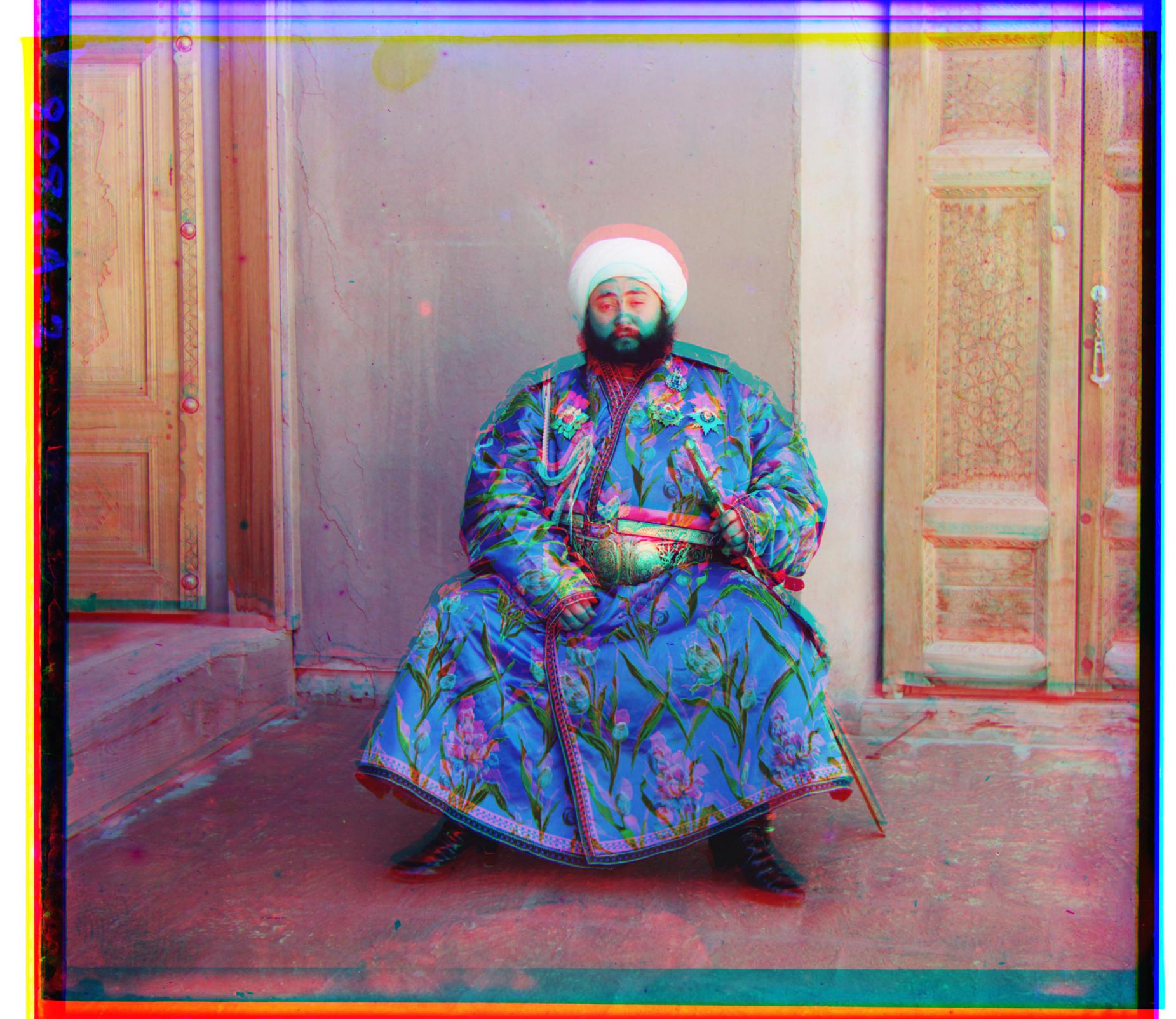
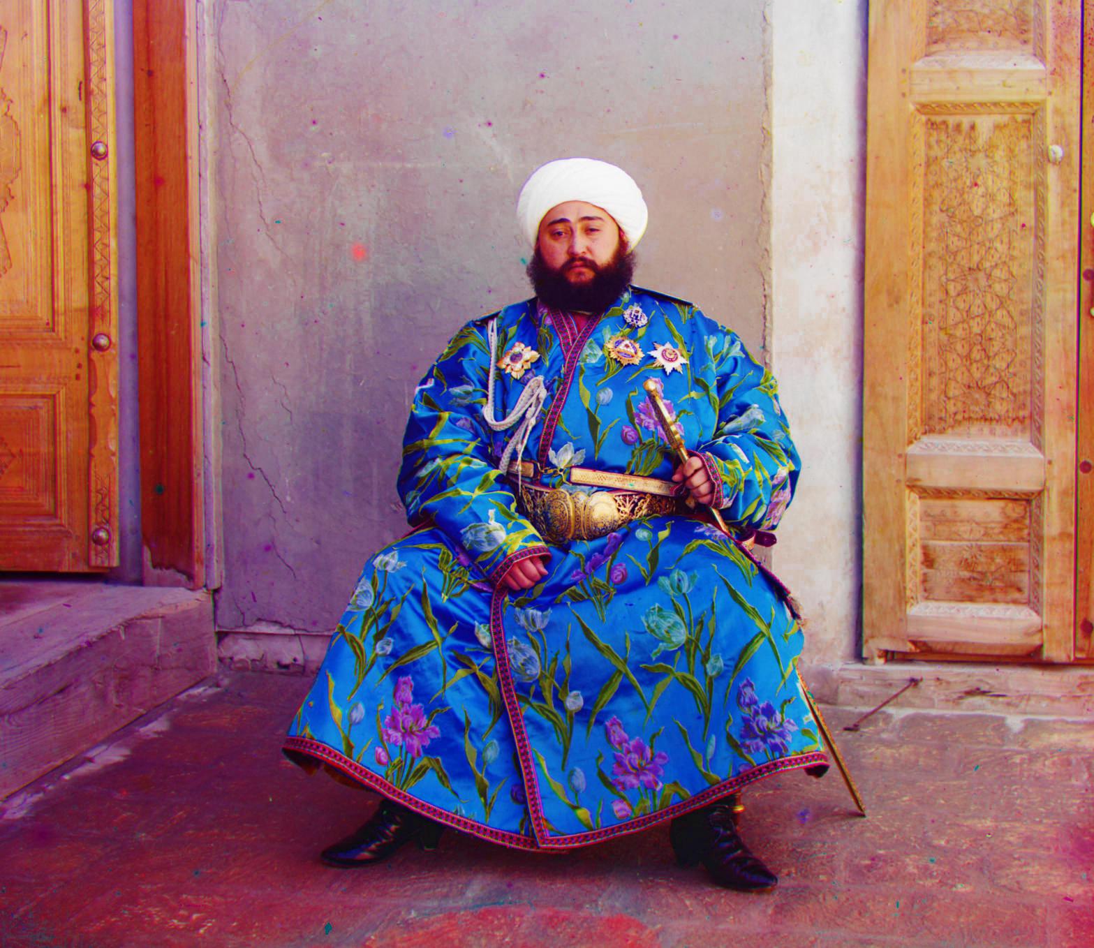
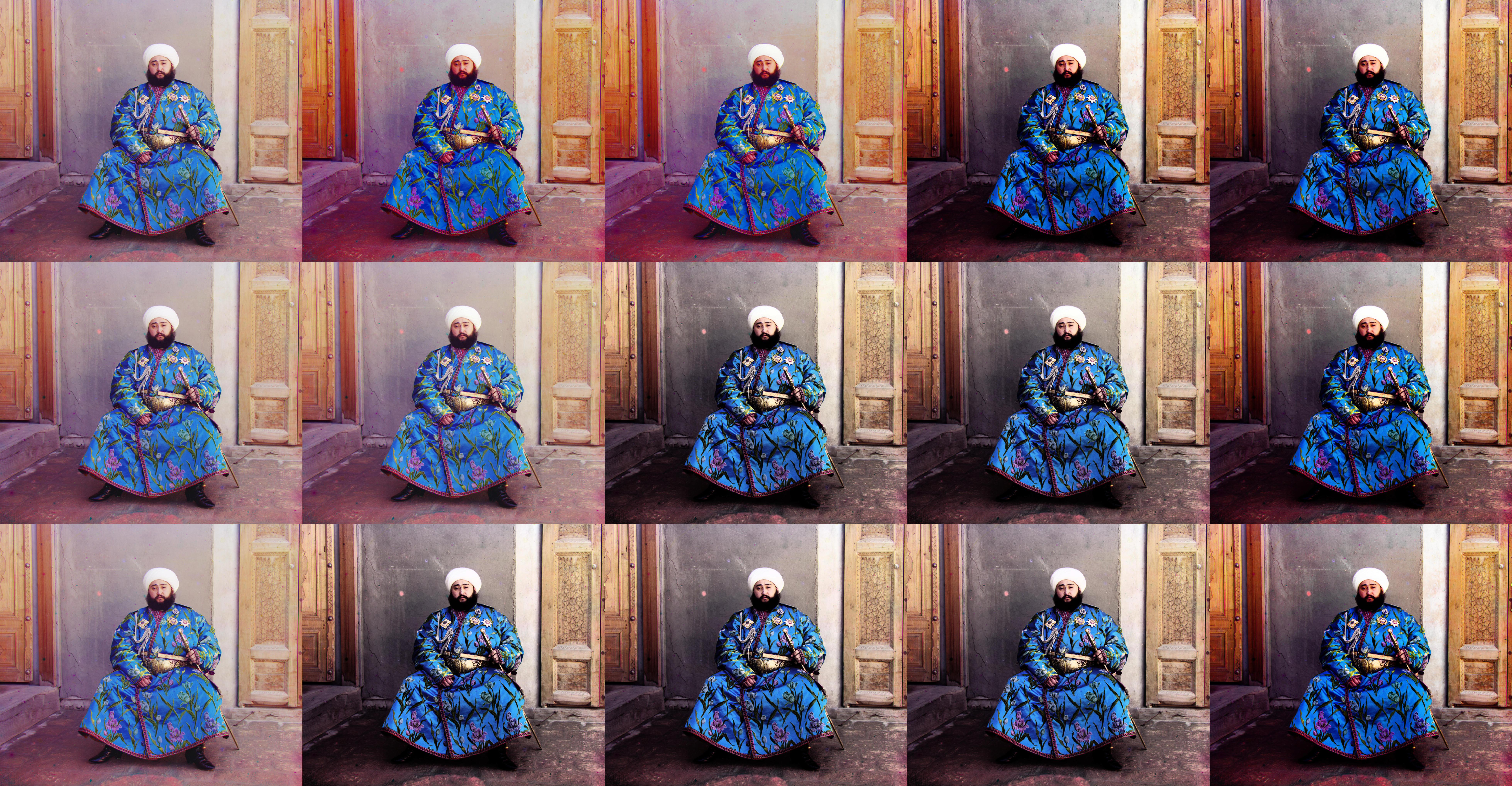
So far we have only aligned on raw pixel intensities from the different color channels which can lead to weird results like in the case of emir.tif. We can also use edge detectors to process the channels first & then use those outputs to align the images. I tried two edge detectors: the Canny edge detector (uses image gradients) and the Sobel filter. Both worked quite well for emir.tif BUT they weren't universally better for all images so I didn't end up using them for my final images. Instead, I used the next trick as it was able to get good alignments for all images.
6. Base Channel Selection
For the longest time I had been using the blue channel as my base for alignments arbitrarily & I never questioned it. While trying to figure out how to make alignments work for emir.tif AND all the other images at the same time, the thought of using a different base channel hit me while looking at the emir's raw channels. I generated colored images using each channel as a base and inspected them.
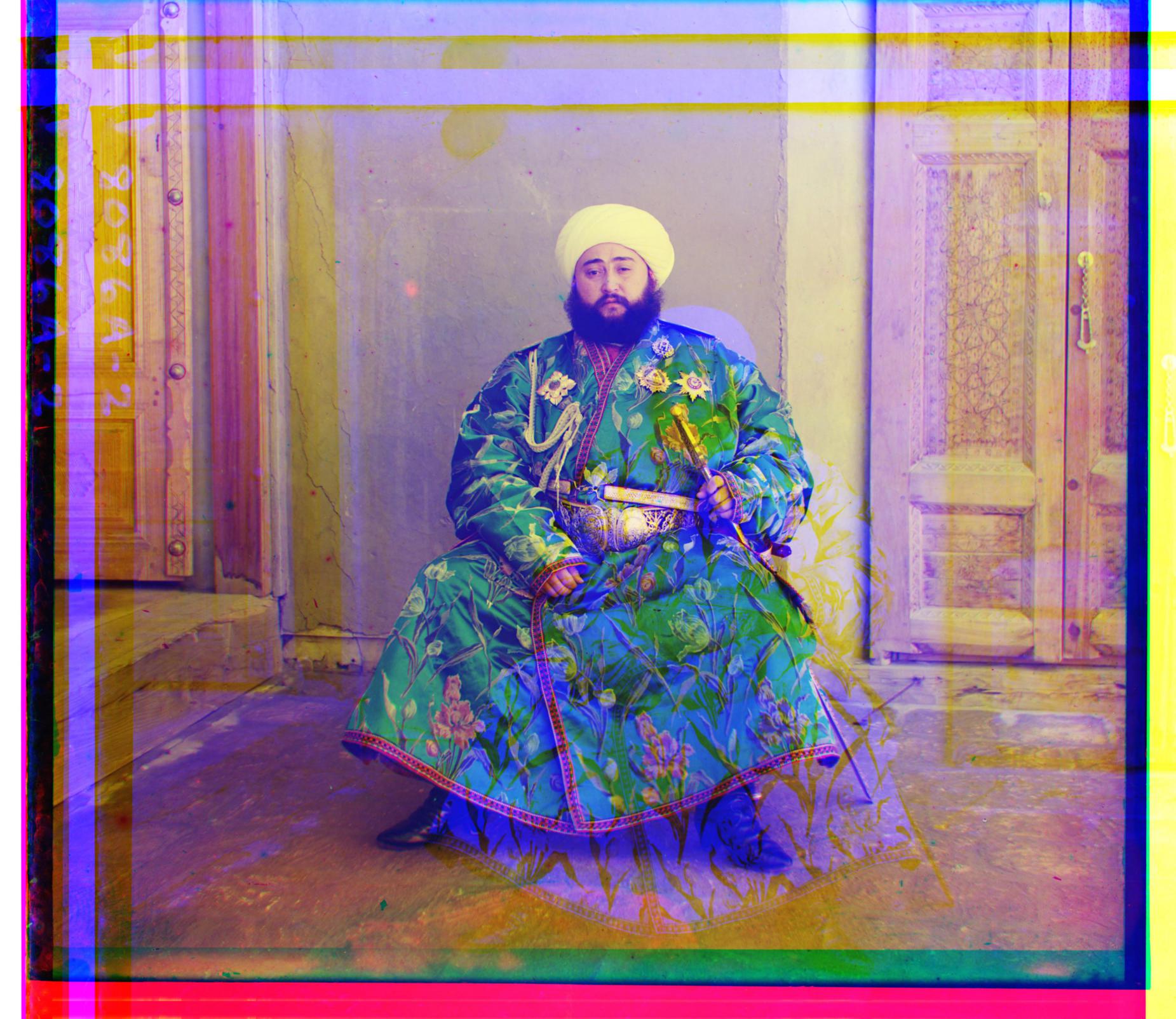
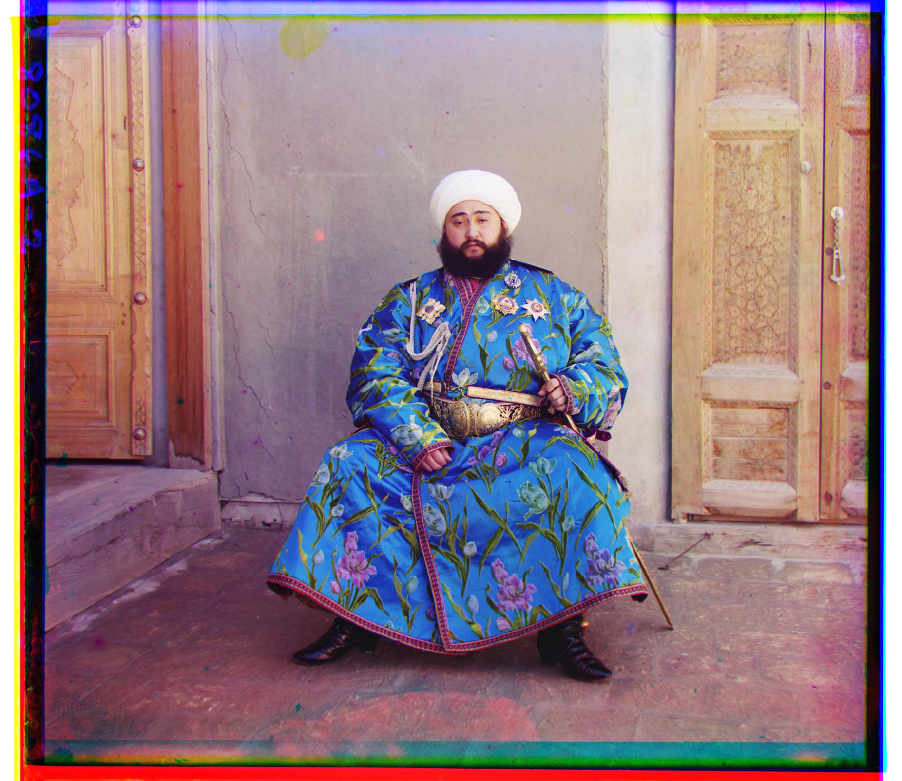
There's a clear difference in the picture of the Emir. As for others, the difference is extremely subtle – but still present. That is why I chose green as my base as it provided consistently good results for all images.
Image Processing
Yay! We have some solid pictures now. Time to make them look pretty.
1. Border Cropping
There are a lot of ways to go about border cropping, I chose a dynamic fixed crop-margin to crop because most images I was working with had very similar-sized borders. This was super simple to implement, maintained the images' aspect ratio, and is really quick as well. Note: It's important that we crop first so the funky colors don't affect the later color processing stages.
2. Auto White Balancing
First converted the colored picture to grayscale to find the brightest pixel. Using that pixel's as the reference color, I scaled all pixel values (of the original colored image) such that the brightest pixel is white.
White balancing didn't have a major effect on most images in their current form, but later we'll see how it can make a lot of difference by daisy chaining it with other image processing filters.
3. Auto Contrast
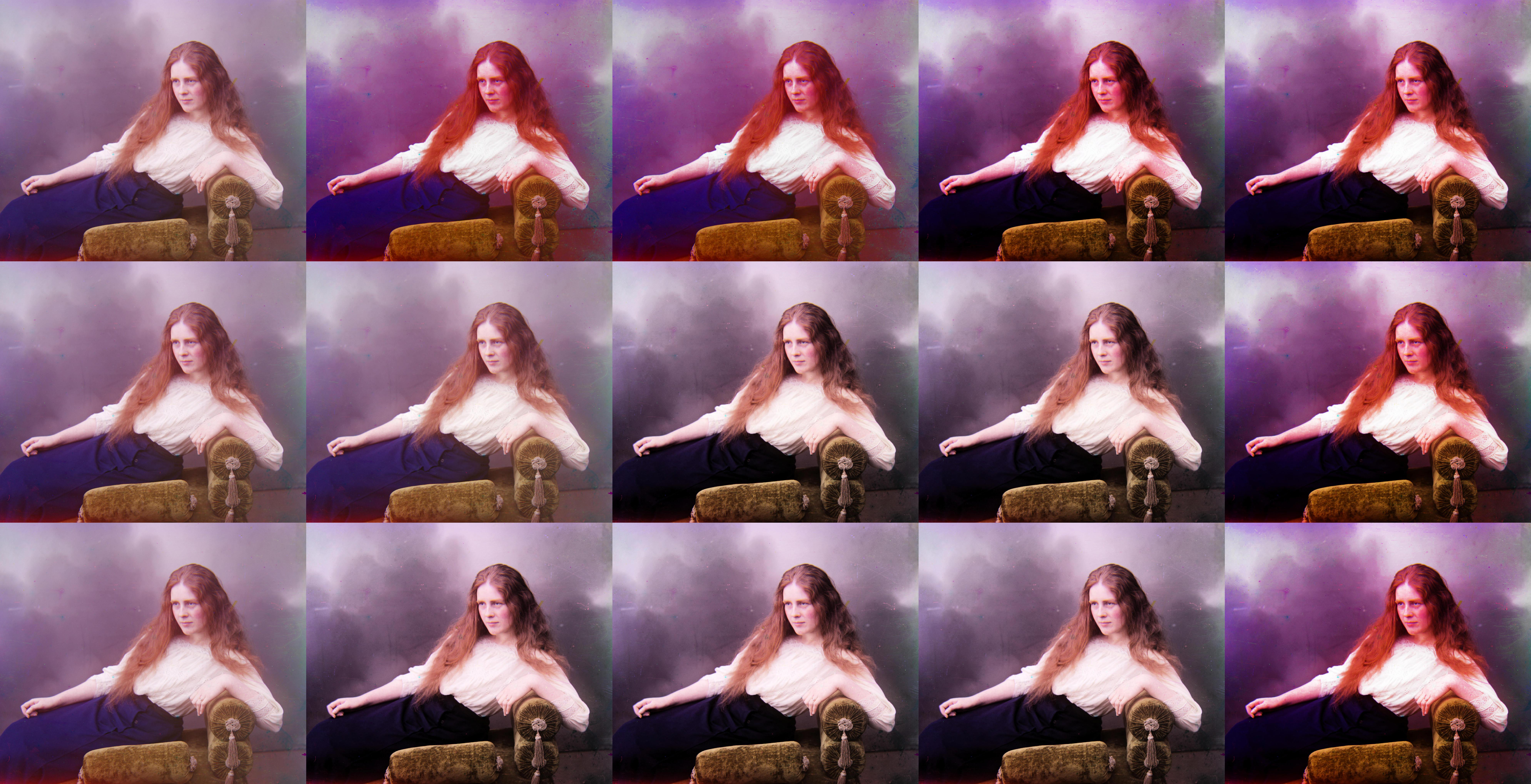
Playing with contrast was quite fun! In my first go at it, I implemented a Histogram Equalization algorithm using the CDF and then applied it to... the RGB channels of the image. Needless to say, the results were trash because the colors were all over the place (right). Looking more into this I realized I need a way to tweak the brightness of the image without changing affecting the overall colors. To achieve this, I transformed the image from RGB space to HSB space and then applied the algorithm to only the brightness layer.
For some images this introduced additional undesirable artifacts but for it yielded great results like the one below.
4. Image Denoisification
Looking at the additional artifacts brought on by the auto-contrast, I questioned if reducing image noise before running auto-contrast could help with this problem. I found that the answer is both yes & no. If you strong noise reduction then, yeah, it does help there but the image loses so much detail that I don't think it's worth doing. And if you do too little, you preserve the detail but the contrast still messes up on those images. Maybe there's a sweet spot where it works but I couldn't find it for the two denoisifier functions I was using: cv2.fastNlMeansDenoisingColored() and skimage.restoration.denoise_tv_chambolle.
5. Making Colors Pop
At this point I had some decent looking pictures, but they were just that – decent. If the Emir was looking at the picture today he probably wouldn't post it on Instagram. The pictures just weren't punchy like all the other pictures we see today on social media. I wanted to fix this.
I don't know the first thing about actual photo editing, I just had a faint idea that what I was looking for had something to do with the saturation of the image. Now, in HSB space you can tweak you saturation directly without messing up the colors. But how should you tweak it? I was lazy so for my first try I just threw the Histogram Equalization algorithm I wrote for auto-contrast at the saturation layer. Just doing that gave me exactly what I was looking for!

6. Operation Order
We have all these filters to apply now, but we still need to decide in what order we should run them. Applying these filters in different order yields fairly different results. I think at this point, the best image is really subjective and it really comes down to personal preference. To see different results I just ran images through different pipelines & saved the results. Here a few of these comparison images.
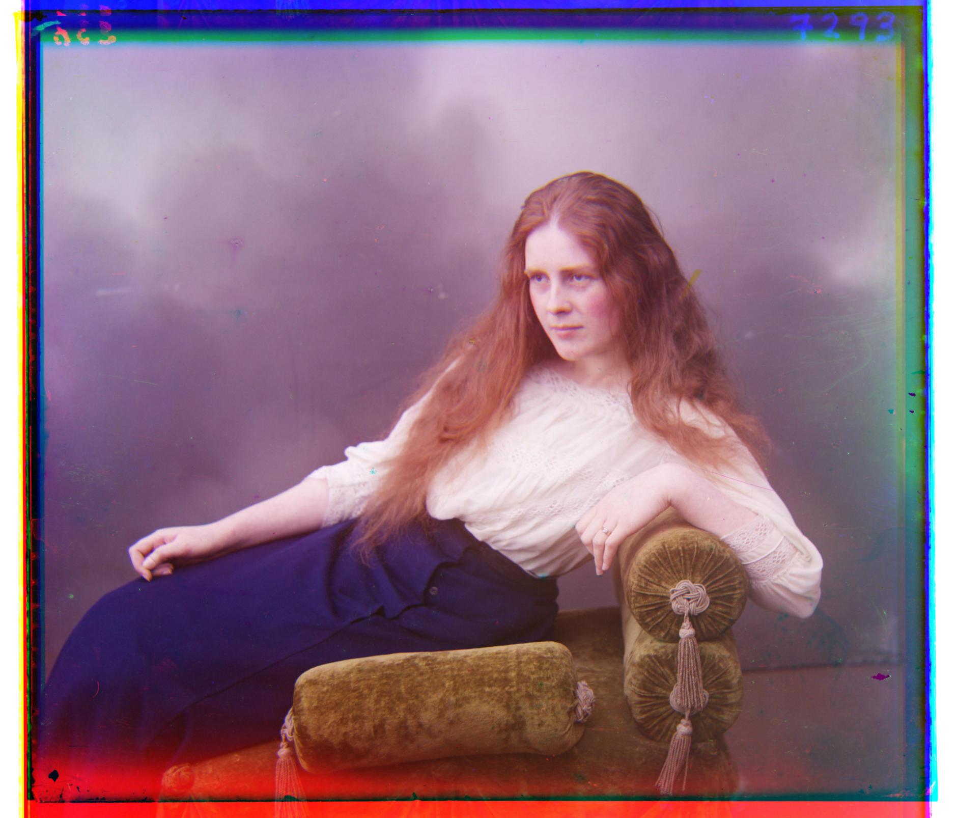
emir.tif
workshop.tif
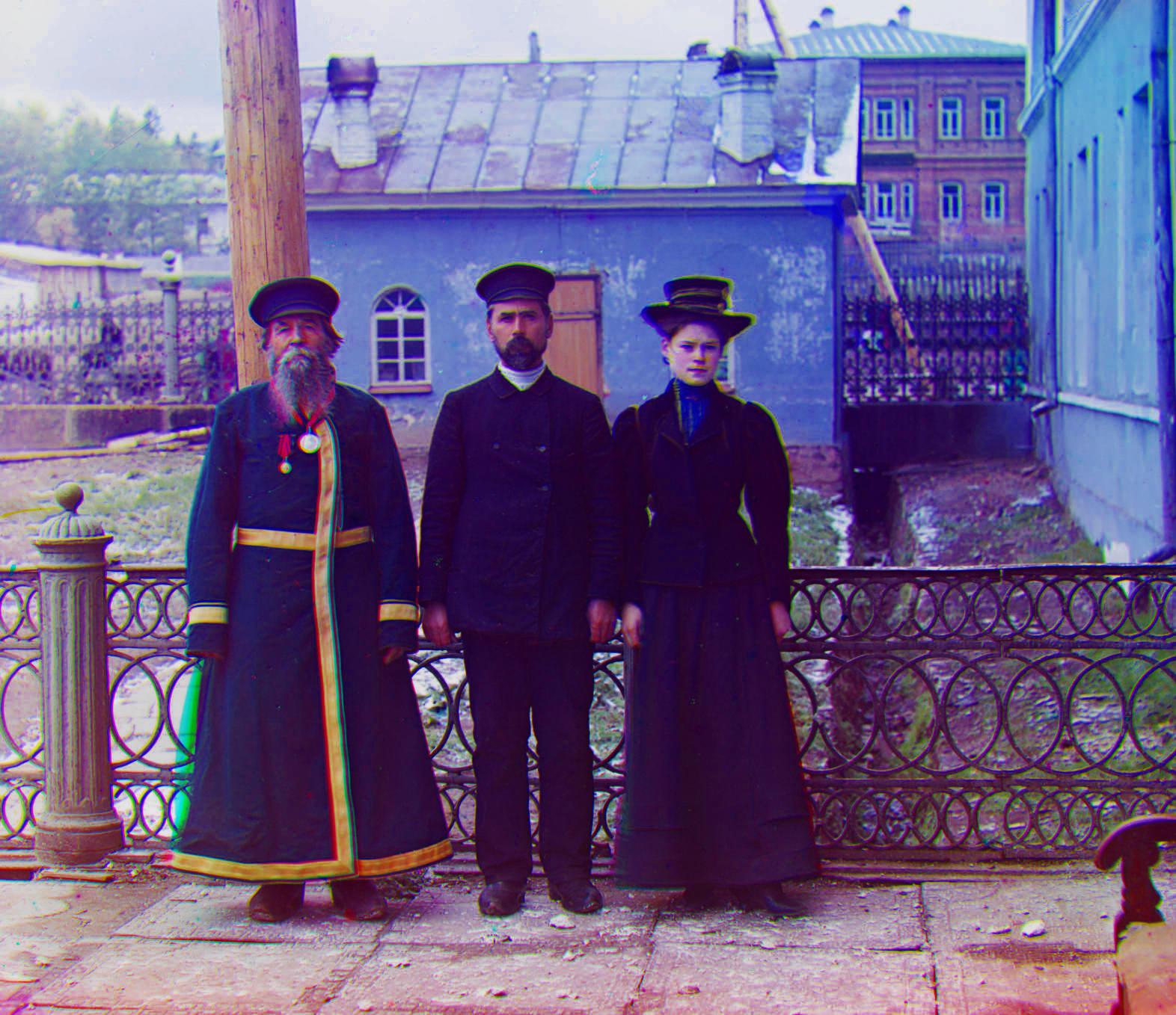
lady.tif
Appendix
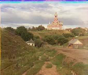
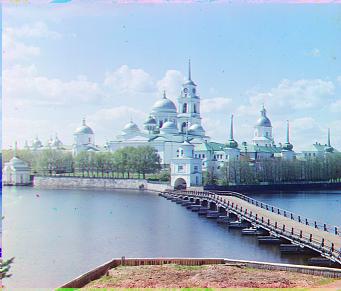
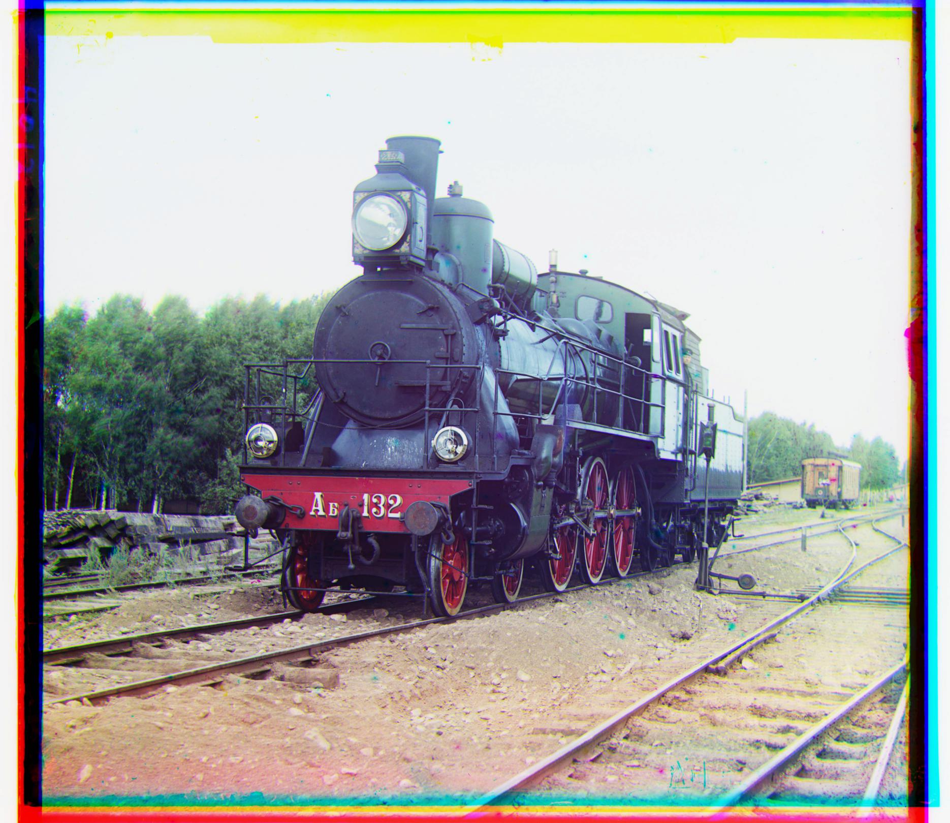
1. Photo Gallery
I looked at multiple processed images for each image & then picked a personal favorite. I think they came out great! Hover over them to see all the post-processing magic :)

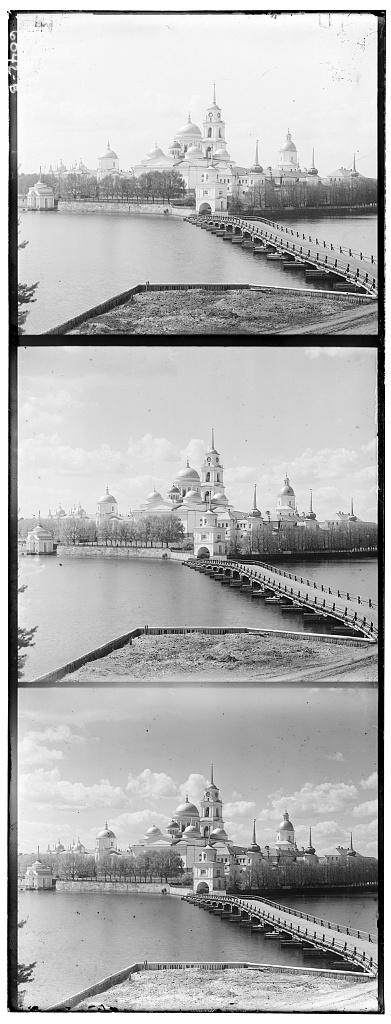
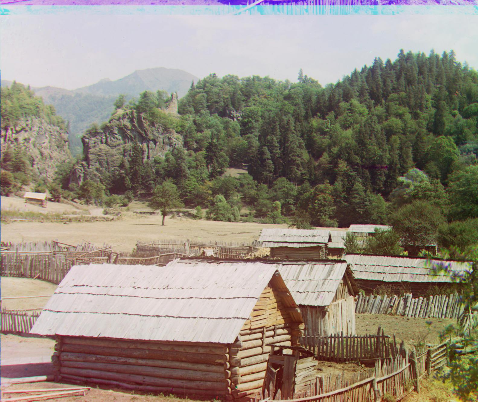
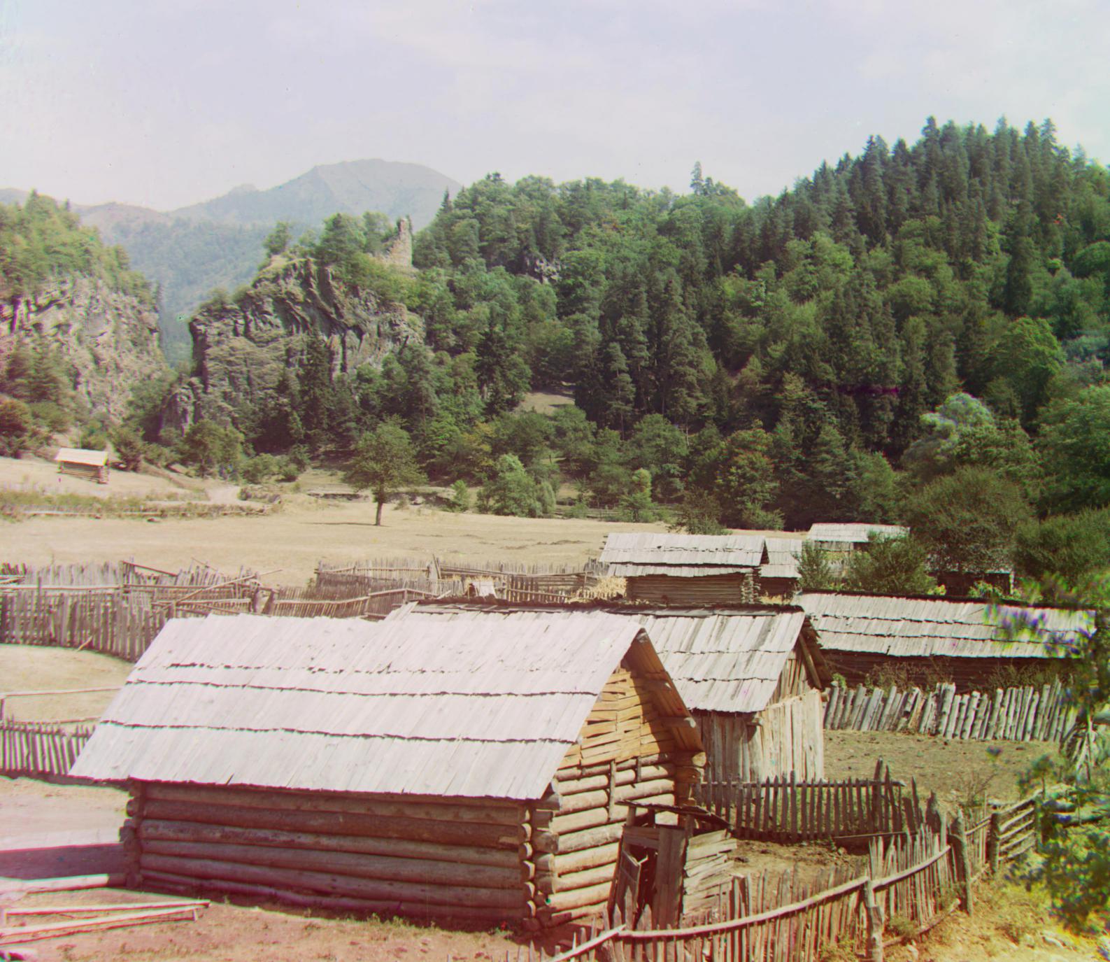
2. Additional Images
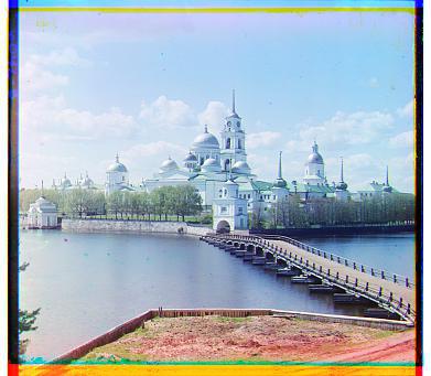
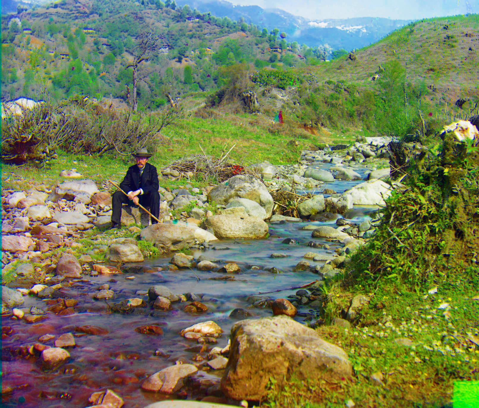
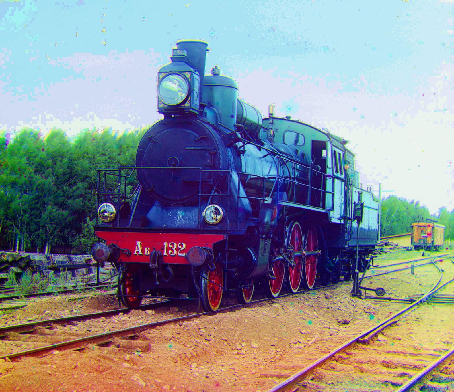
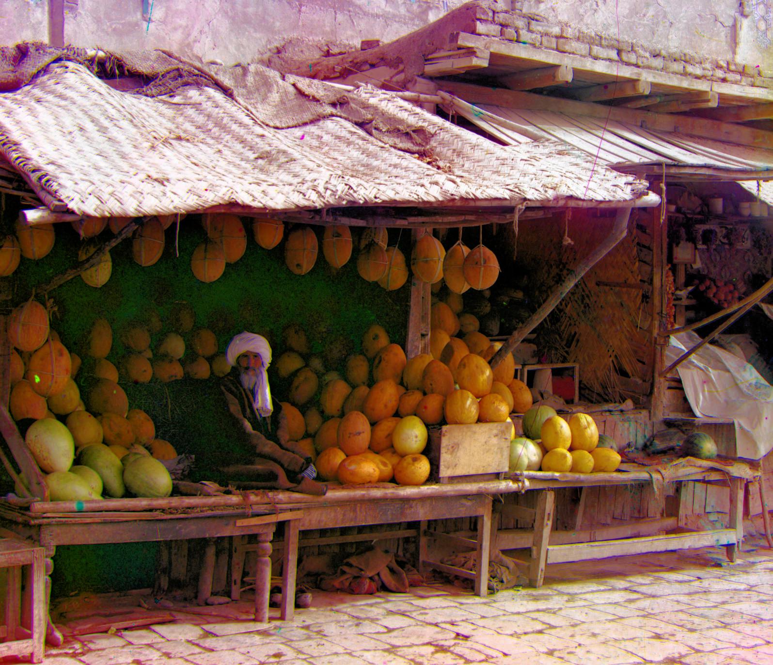
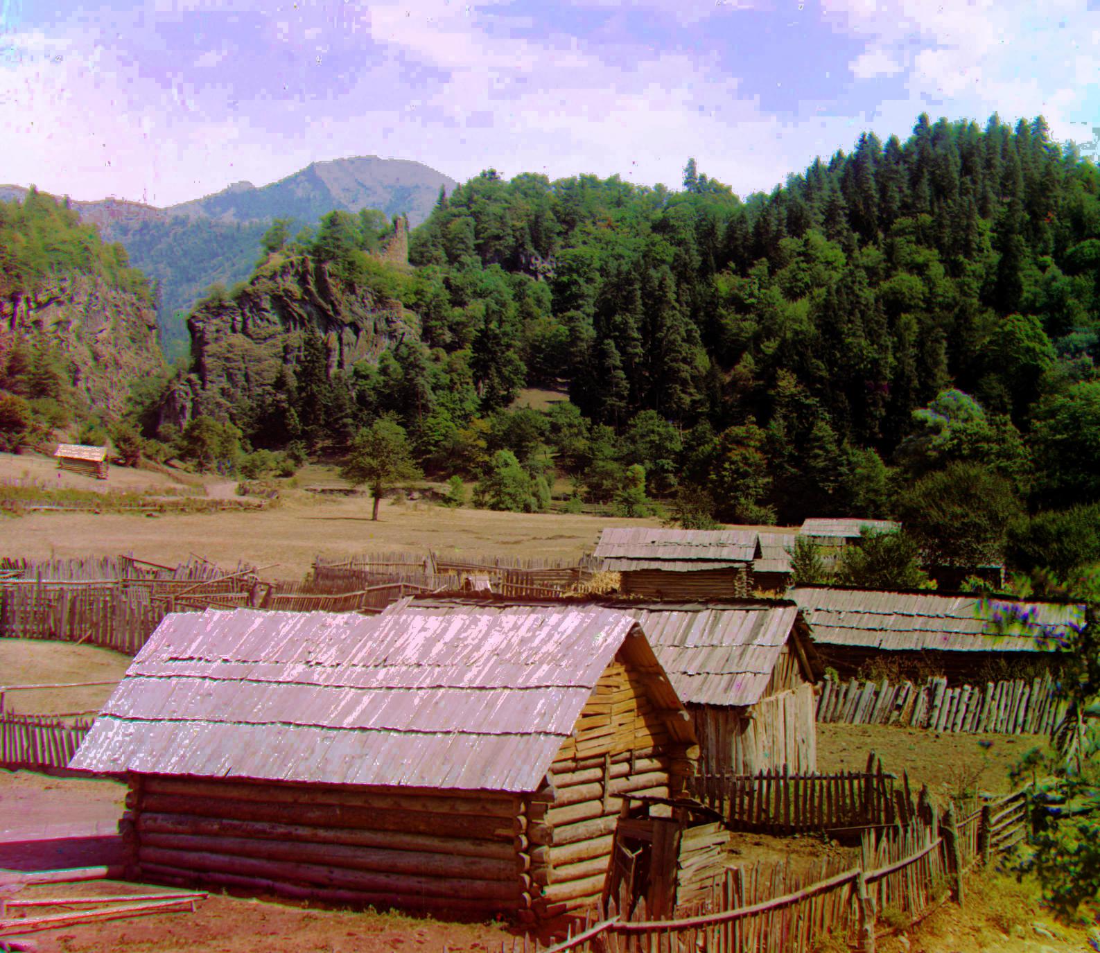
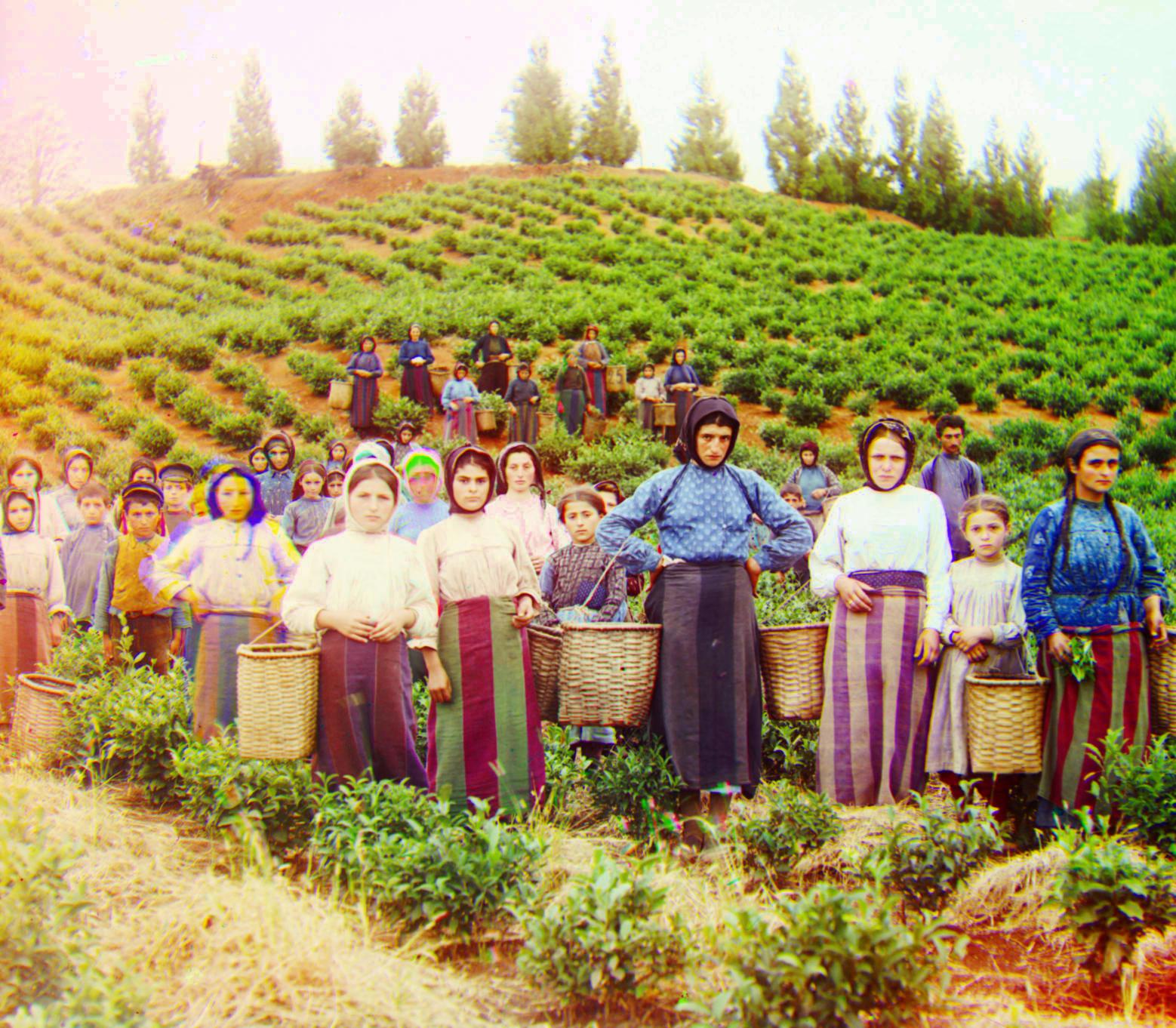
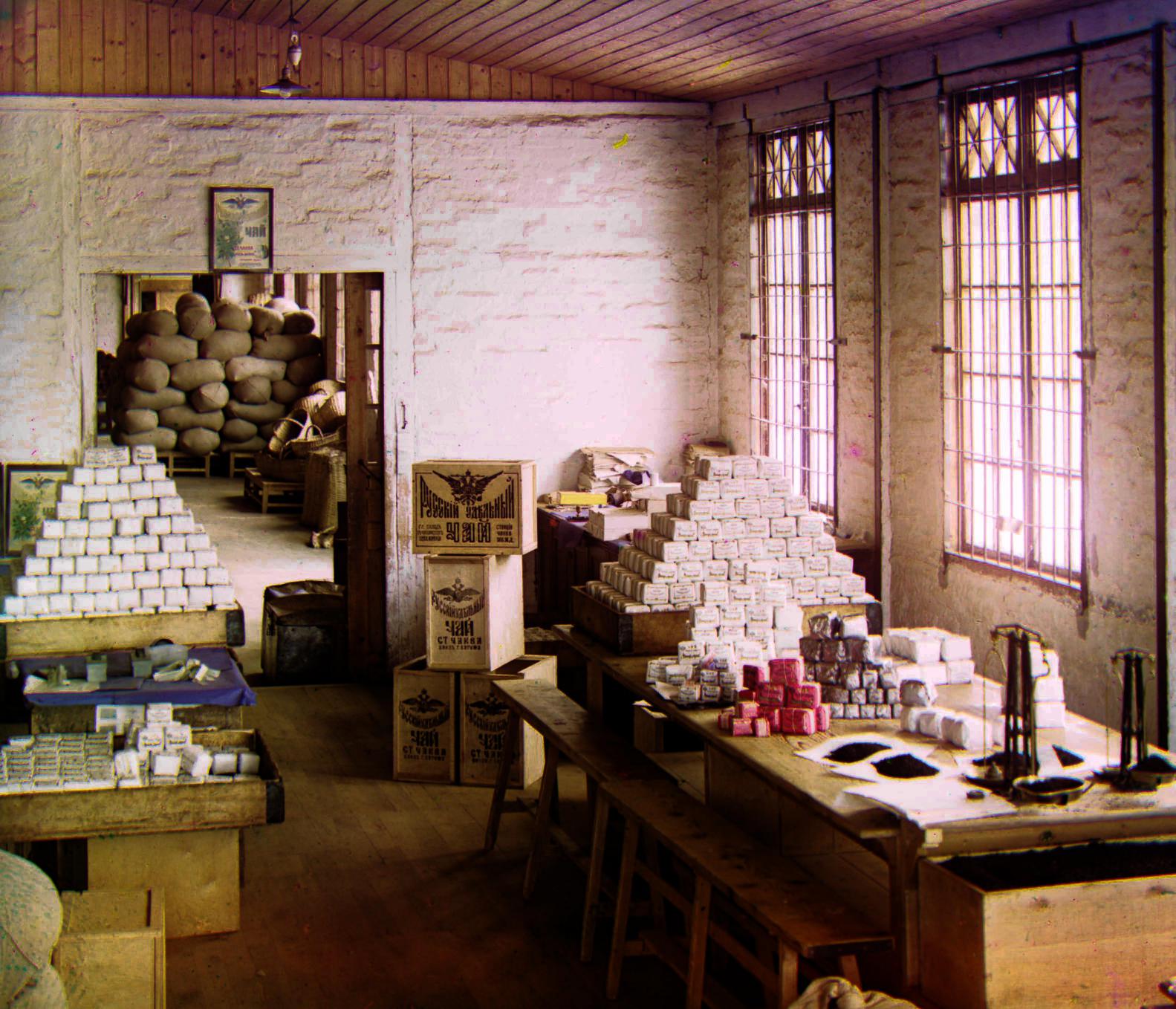
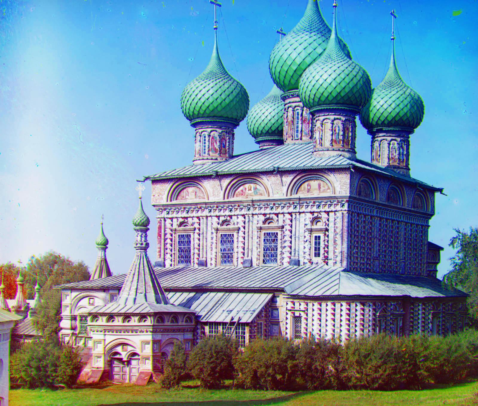
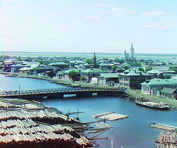
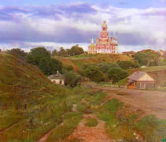
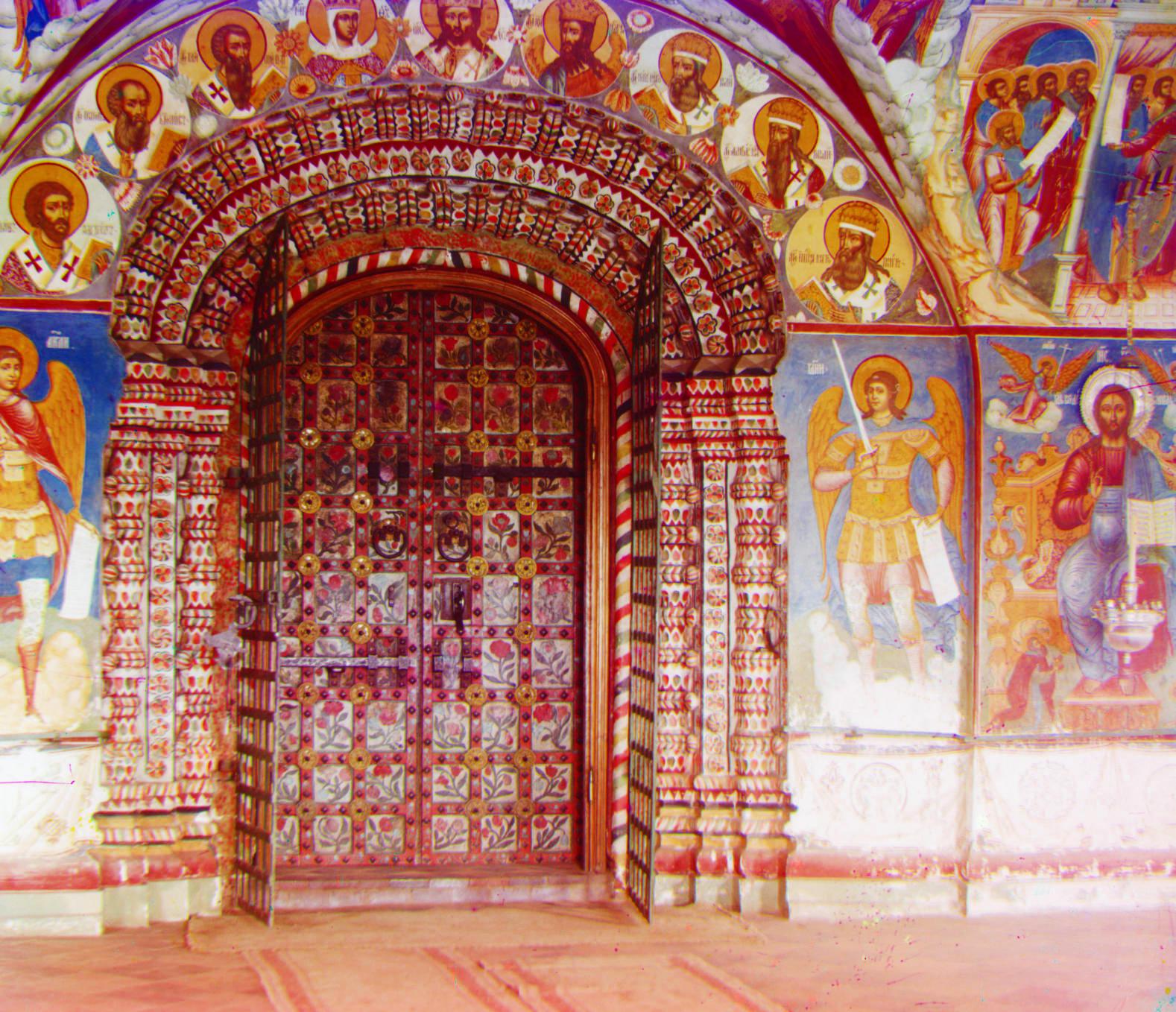
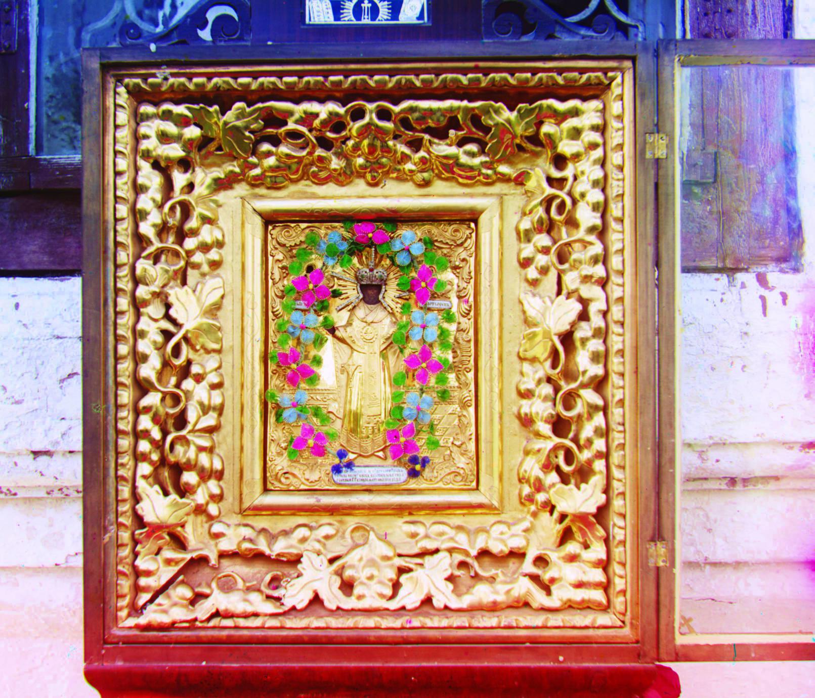
Here are some additional pictures from the Library of Congress's website which I colorized (align + post process).
3. Offset Values
The offset/displacement values for the Red & Blue channels used for alignment for result verification.
| Image Name | Red Channel Offset | Blue Channel Offset |
|---|---|---|
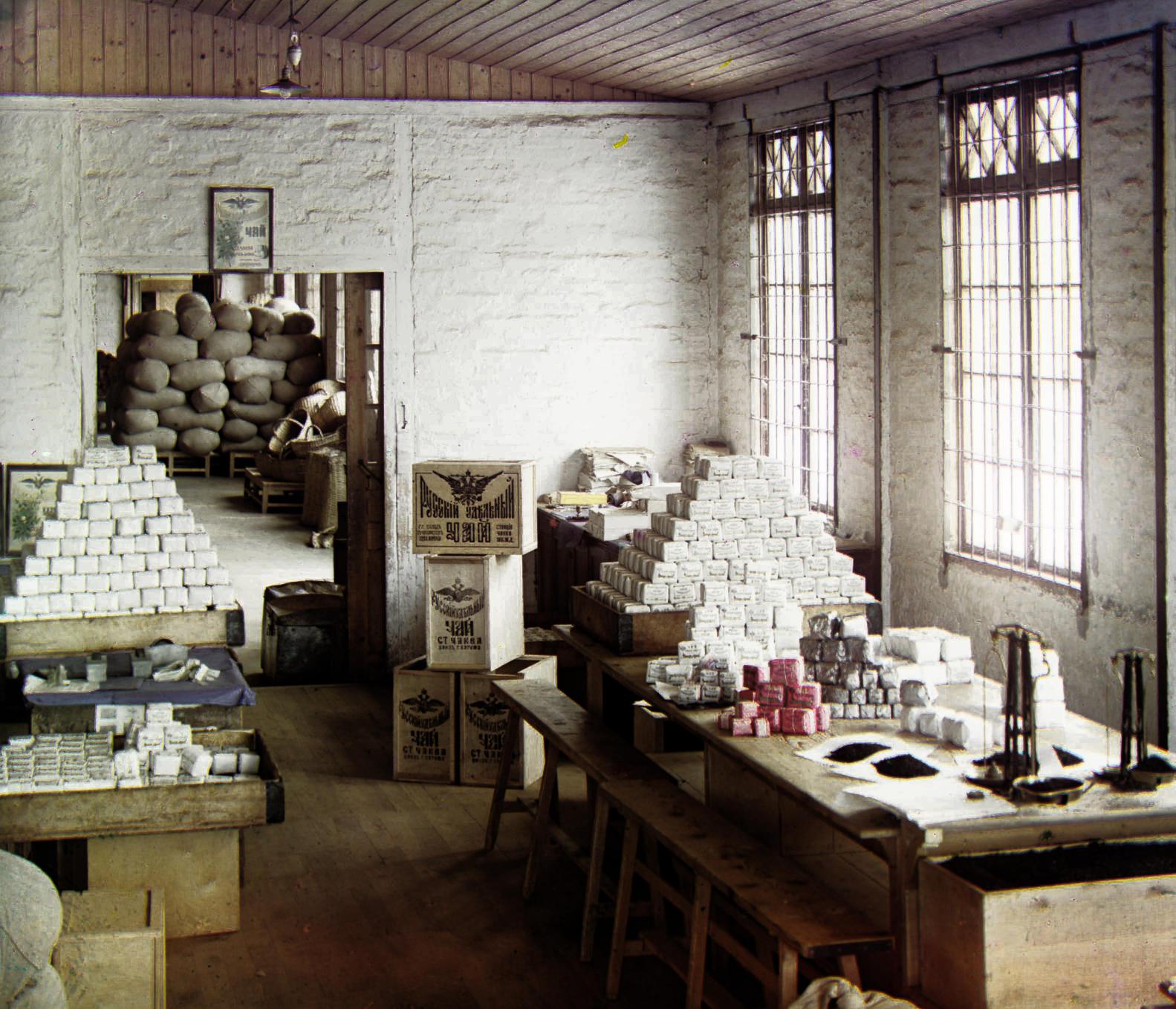
| workshop | 52 and -11 | -53 and 0 |
| emir | 57 and 17 | -49 and -24 |
| three_generations | 59 and -3 | -53 and -14 |
| castle | 64 and 2 | -34 and -3 |
| melons | 96 and 3 | -82 and -11 |
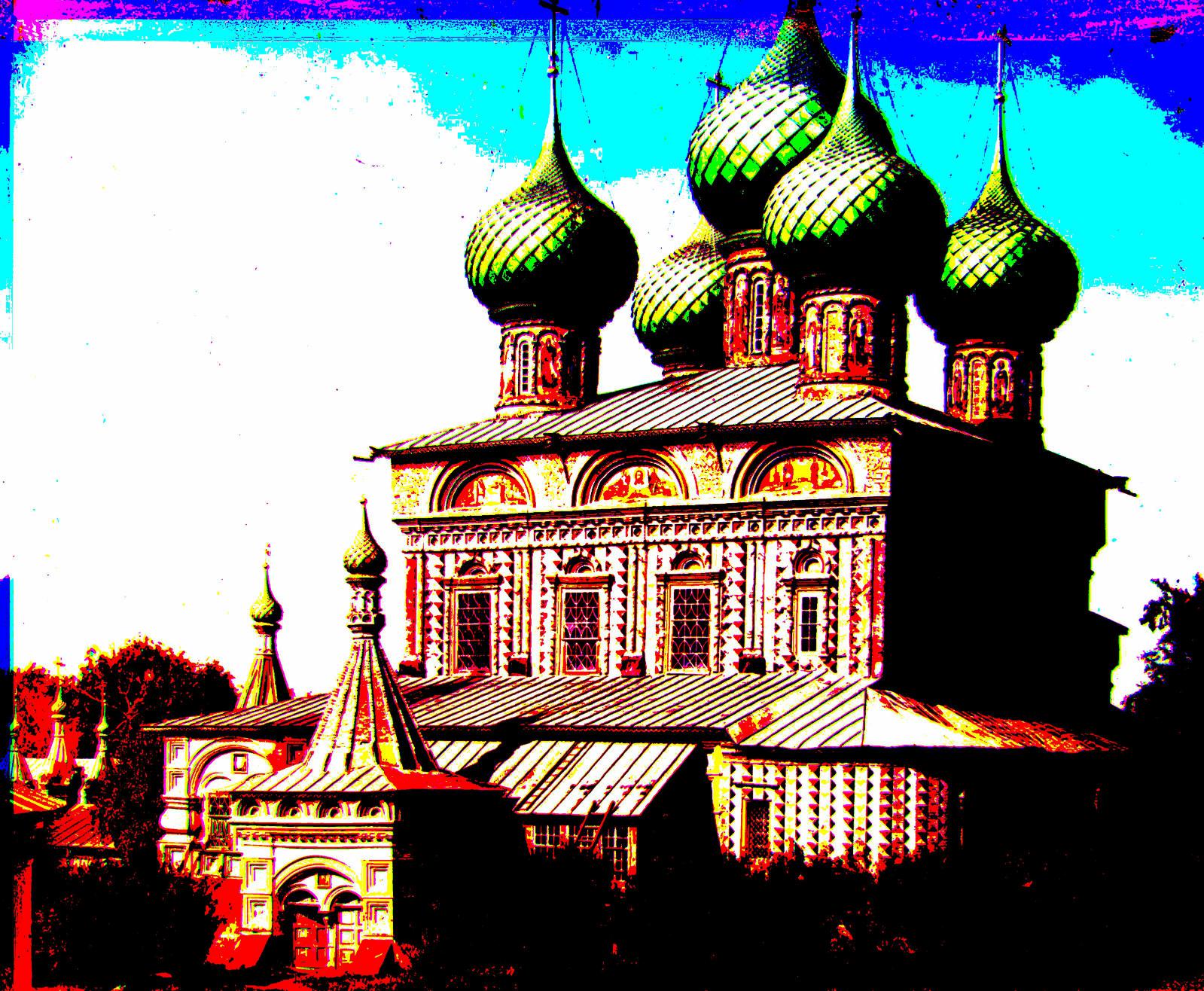
| onion_church | 57 and 10 | -51 and -27 |
| train | 43 and 27 | -43 and -6 |
| icon | 48 and 5 | -41 and -17 |
| self_portrait | 98 and 8 | -79 and -29 |
| harvesters | 65 and -3 | -59 and -17 |
| lady | 62 and 4 | -55 and -9 |
| monastery | 6 and 1 | 3 and -2 |
| tobolsk | 4 and 1 | -3 and -3 |
| cathedral | 7 and 1 | -5 and -2 |